Showing posts with label Research. Show all posts

Monday, 6 June 2016

Food Photography


Research into food photography, definition found from wikipedia.


I found another food photographer called Okuprin, I have decided to go with the modern rustic look. Okuprin again uses grading to enhance and create the rustic look, also by having the right background and lighting this makes the food look very professionally finished.


Example of good use of lighting, and grading.

There is a red colour scheme going on in this photograph, which contrasts well with the grey, the plates are high quality which makes the photo also look even more of a high standard. Using fresh raw ingredients makes the food look even more fresh and appetising, having more of a home cooked look.

Studio Space, Photo Grading

I have been researching into food photography, and the different techniques used when photographing food. I learned about lighting, and grading the photos to enhance the overall look of the food. Having the right setting/studio for the photographs makes such a difference, also the lighting can really bring out the food in the photo on the parts you want the audience to focus on. Here are some examples of food photography that really stood out to me.


I found this from Pinterest, originally from pearsonlyle.co.uk

I think that the photo is appetising, the lighting used really brings out the food. By using an overhead shot you can get overall view of the food. The colours are natural colours, and nothing in the photo is too bright, so your eyes are not just lead towards one part of the photograph.

By putting text on the photo you could use this as an introduction to a new chapter in the magazine. Overall the photo has a very homely feel to it, and is very welcoming.


I also found this from pinterest I like how the overall photo looks, the food is presented very well and compared to the first example it is more high end. The cutlery is posh, and by having a black background and dark plate it creates a rustic look. The focus is still on the food, but it has a different effect on the viewer as they look at the quality of the image layout and not just the food itself.


I quite liked the rustic theme that seemed to be going on throughout the photo's I was researching, I came across this photo from Pinterest. I liked the grey colour scheme that was going on, the photo is also graded making the colour more neutral rather than prominent. 

Monday, 2 May 2016

Drawing with collage Preporation

I am going to do a Drawing With Collage workshop soon so I thought I would research some artists who use collage in their work, also It will give me ideas for my work and what I could gain ouut of doing this workshop.


https://en.wikipedia.org/wiki/Collage

Digital collage

Digital collage is the technique of using computer tools in collage creation to encourage chance associations of disparate visual elements and the subsequent transformation of the visual results through the use of electronic media. It is commonly used in the creation of digital art.

I researched two Types of collage as the artists that I researched used a large variety of media's in their work.
I found this Artist from Pinterest, the original artist is unknown as their web link page was no longer available. The Artist uses digital collage , combining photography with paper textures to create one solid image. I like the way the roses stand out so much, even though the Artist has made them black and white, it creates depth to the image as a whole. The face is only half visible which makes the audience more curious and intrigued by the work, it also suggests the Artist is trying to show the thoughts of the character in the picture. To be more critical about the Artists work I would say that the solid black triangle and the pink moon don't quite work with everything else being black and white, I find that they look a bit out of place and distracting from everything else.

Pinterest link https://uk.pinterest.com/pin/477029785512054741/

What I aim to get out of this workshop
From researching various Artists I have realized that collage could be very relevant to my project theme and I could use this media for my magazine layout. It could make the page more eye catching and bold, drawing the reader in. I want to experiment with different types of collage including digital collage to see what layouts I could achieve.

This Artist works for clothing lines and companies creating layouts to display the clothing items using collage. Here where the original images used.

Website http://www.polyvore.com/asdfhjkl/set?id=64857337

This artist has created a collage for a company called YAY, it was published on style spotter which is a clothing and fashion site. The artist is on tumblr, all links are below.

yay

STYLE SPOTTER
Joined three years ago. 
I love the style of the work, it is quite quirky and funky, it really displays the outfit well. the black and white image of the woman works well in contrast with the colour and textures of the background. The Artist has also made a bold white outline around the model, separating the focus from the less important images. Media; paper collage and digital skills to finish.

Here is another example of collage by the same artist, This fits in with my theme really well, and is an effective way of displaying my items for sale.

I found some examples of collage in the magazine that I was inspired by. I possibly could use this technique for displaying my bags and gift shop items.

Sunday, 24 April 2016

Herb Lubalin

Herb Lubalin

Herb Lubalin was an American graphic designer, he worked with Ralph Ginzburg for a magazine company, he created and designed the typeface ITC Avant Garde.
Lubalin's work is creative and elegant.  I love the use of typography in his logo's, for each company you can see that he has clearly adapted the style of typography to fit the theme and character of the business. Unlike Paul Rand's work Herb Lubalin creates a 3-D effect in some of his logos, however both artists stick to minimal colours in their work. I like how Herb Lubalin's logo's are almost an artwork in itself and not just a logo, for instance the mother and child logo, you can see that he has beautifully created the image of a mother carrying her child within the o of the word mother.
To conclude I think that both artists are unique, and each have different qualities to their work, although i think that I prefer Herb Lubalin's work because of it's individuality of each of his logos.

Logo Designers

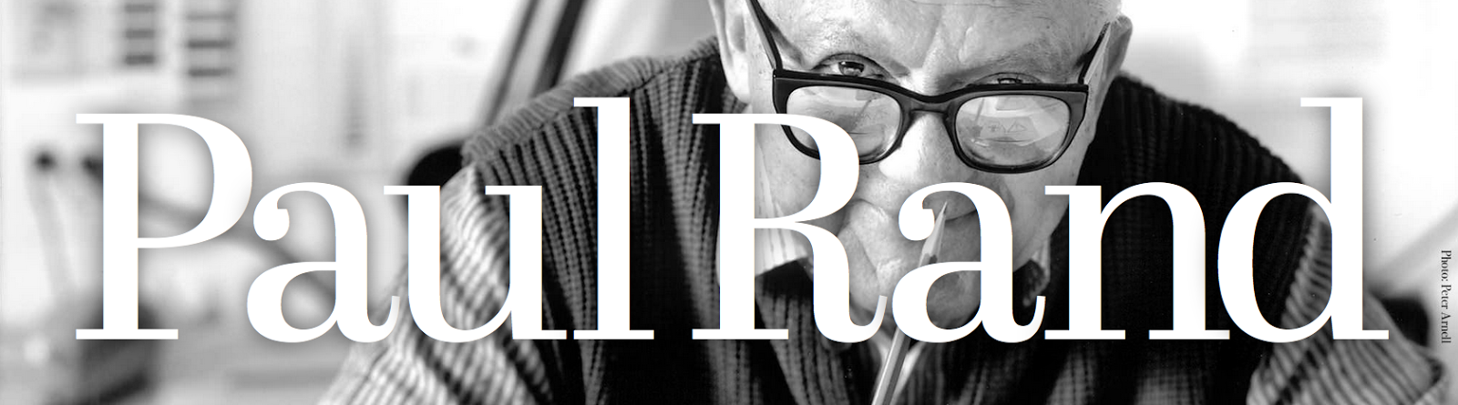
Paul Rand

Here’s what a logo is and does: Written by Paul Rand himself.

A logo is a flag, a signature, an escutcheon.
A logo doesn’t sell (directly), it identifies.
A logo is rarely a description of a business.
A logo derives its meaning from the quality of the thing it symbolizes, not the other way around.
A logo is less important than the product it signifies; what it means is more important than what it looks like.

Paul Rand was one of America's leading modern graphic designers, his work included advertising, book and corporate design. He studied at Parsons School of design in New York City, although the majority of his work was self taught.
His Logo designs have a fresh and clean look, I have noticed from studying his work he uses a lot of negative space in his work, this makes the eyes focus on specific parts of the logo such as the text. Paul Rand also sticks to a minimal amount of colour, this way it is still bold but isn't distracting and overpowering.


Saturday, 23 April 2016

Looe Cornwall

I am basing my project on a small town called Looe in Cornwall, it is a beautiful place with a welcoming feel and community. It is also right by the coast, I took a visit to Looe today and talked to a few people, asked questions and gathered information for my project.

Some of these questions included
Are you visiting, or do you live locally?

Describe your surroundings in less than 10 words.

Describe how life by the sea makes you feel in less than 5 words.

I got some really interesting responses from people and most of them where not living locally. Some of these responses where "It makes me feel at peace, the surroundings are very calming and I don't want to go home when I'm here."

" The atmosphere and surroundings are very relaxed, a word to describe how I feel when I'm here,  invigorated"

I hope to go back very soon and talk to some more people as I found this experience really interesting and beneficial, It gave me inspiration for magazine articles that I could write and my target audience. The community there is very friendly and open, it's a lovely place to be to break away from the busyness of the city.

Friday, 22 April 2016

Ophelia Pang

I found this artist on blogger, They also use silk screen printing to create tote bags and purses, I like that the designs are very bold and colourful. The artist uses a variety of shapes and lines to create a picture and paint a scene. The art has a child like features in the drawings and designs which makes it quirky, intriguing and fun. I could use the style as inspiration on how to develop my final design because I definitely nee to make my design more bold. I also have to bare in mind that I am limited to using only one solid colour for each print, and I can't add all the different colours onto one print because I would need to split my design into separate layers so I could add different colour to different parts of the pattern


Blog : http://opheliapang.blogspot.co.uk/2015/06/more-tote-bags-mock-up.html?utm_source=feedburner&utm_medium=email&utm_campaign=Feed:+blogspot/yFIMw+%28Dirty+Paws%29
contacts : opanghk@gmail.com
Published by blogger

Tuesday, 19 April 2016

Magazine Layout Ideas

Here are some pictures I have taken for inspiration from the suitcase magazine. I love the high quality pictures, the photographers really capture the essence of the places, showing the atmosphere and vibrance of the place.

 I would like to include a section featuring the people and subjects that are in the magazine, I think it is a more creative and visual way of displaying the contents page.
 The way that the writing is layed out shown in the example here is very effective in grabbing the readers attention. I like how it has a key quote from the article in the centre of the page, this way the reader gets a hint on what they are about to read. It also makes the reader wonder ask questions about the text, making them want to read more.
 Towards the end of the magazine there is a photo journal, i thought that it would be a good idea to make a photo journal also. This way I can focus my photography on one subject instead of having a random group of photo's. It will also give me an opportunity to explain the photo's and write the story behind the photography.
 I have been looking for inspiration for titles for my articles, this particular title captured my attention.
 Layout Designs
I thought that this was almost like a collage, It was the first page of one of the interior design magazines. I like the choice of photographs and they blend nicely together and flow, rather than looking like a jumbled selection of photo's.


 Photo Collage from the interior design magazine.
 Photo Collage
Nice Layout for displaying a key quote or piece piece of text.

Wednesday, 13 April 2016

Magazine Style and Audience


I have been doing a lot of research into different types of magazines and from this it has given me lots of questions and things to think about. I am now starting to develop the style and type of magazine I want to create, my audience is also key. From looking at different magazines without concentrating on there themes too much, I have come to the conclusion that there are two different types of magazines I can go for.

The first type of magazine is a community magazine, for example I have been  looking at the Looe magazine which is made for the community of Looe in Cornwall. It is a free magazine that is handed out to people in the community, it is an informative magazine that talks about news and the latest events that have happened and events in the future that people may want go to. This magazine is also aimed towards tourists who are visiting as it can be found at the local tourist information centre.

The second magazine is a travel and fashion magazine, I have been looking at a magazine called Suitcase. This magazine is aimed at young professionals who love to travel, the subjects it covers are completely different to the other magazines that I have looked at. Its is informative but in a different way, it tells stories other than a news report, you feel like you are reading a short novel and experiencing the place yourself rather than just being told what happened. It features local businesses but that is not it's main focus or theme. It wants to grab the reader and make them admire the places it features, and make them envy the people that live there. The magazine has a modern look, it looks clean and fresh. The pictures fill the page and the photography is of a very high standard which also draws the reader in as if you where there yourself.

To conclude I think for the content that I want to include in my magazine, I think I am going to create something similar to the travel and fashion magazine. I am going to base my magazine on the Suitcase magazine, as that was my inspiration for this project. I like the whole layout of the magazine and the writing and fonts used, so to further my research I am going to do a survey to find out more about my target audience.

Tuesday, 12 April 2016

Printing


Here is another way of printing that I found from an artists website called The Crafted Life. I like the typography used on the bag because it a water colour effect to it, and it is very minimalistic.

Website :http://thecraftedlife.com/iron-transfer-girlboss-tote/
Pinterest : https://uk.pinterest.com/pin/477029785511798174/

Gift Shop Items


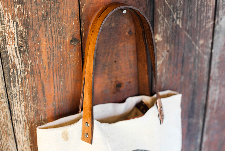
I found this bag on Pinterest made by a blogger called Poppy Talk, the handle was made from an old belt and looks very effective against the white material. This inspired me to try to find creative way to make my items without making them too complicated and expensive.

Blog link: http://www.poppytalk.com/2013/08/diy-feedbag-tote-wleather-straps.html

Pinterest link: https://uk.pinterest.com/pin/45950858674598939/

Silk Screen Printing Workshop


 I plan to do a silk screen printing workshop so I have been researching artists who use silk screen printing in their work. Sarah Abbot is an illustrator who uses silk screen printing, I liked her work because of the solid colours she uses. Her work is bold and eye catching, the style of work has a natural theme throughout and she focuses on greenery, plants and nature. I would love to incorporate some of this style into my own prints, using the theme of sea life.


Monday, 11 April 2016

Izziyana Suhaimi


Izziyana Suhaimi is also an embroidery artist, she illustrates people by sketching and using watercolour, then incorporates embroidery into her sketches to add colour. She mainly uses her embroidery to show fashion in the clothes that the people are wearing in her illustrations. The patterns she creates using embroidery are vibrant and floral, her work is very similar to Sarah Benning as they both have a unique way of using thread and stitching to illustrate the world 
around them.

Website: http://www.izziyanasuhaimi.com

Instagram: https://www.instagram.com/izziyanasuhaimi/

Gift shop items


Sarah Benning is an embroidery artist, she also studied fine art. Banning has a unique way of illustrating through her embroidery, she uses very neutral colours and creates detail with the contrast of colours she uses. Her work mainly focuses on the natural environment such as green plants, and occasionally she will do portrait work. I think that her work and techniques could be used to create small gift shop items to include in my magazine, such as keyring's or purses.

Website: http://sarahkbenning.com/about/
Instagram: https://www.instagram.com/sarahkbenning/

Sunday, 10 April 2016

Exploring The Coast


 I went out to explore the coast and see what local businesses I could find by the sea such as artists and fishermen. From this research I would like to possibly feature some of the businesses produce in my magazine, such as using the fish that I buy from the local fishermen in my recipes.