Monday, 20 June 2016

Unit 9 Creating a behance account


To futher my opportunities and experience in working in the graphic design industry, I have joined Behance. Behance is a social networking site that allows professionals to communicate and discover work opportunities by connecting with people in the same industry. "discover the latest work from top online portfolios by creative professionals across industries.' as quoted on Behance www.behance.com
I have recently uploaded one of my final pieces onto my Behance account, I have also followed 10 professional creatives in the graphic design and Illustration industry. This has allowed me to view other peoples work, and jobs that are available in the industry this in turn could help me to develop a more solid idea of what job I am looking for when I finish my education.

Magazine layout


 From my research on magazine layout designs, I started to create my own layout. I liked to combine my photography and use it as part of the final background for some of my pages, such as this photo here used as the background for the recipe. Also you can see here that I cropped a lot out of the original photo, as I felt that there was too much going on in the photo, also some of the items in the background took the focus away from the food


Preparing the food


Before photographing the food, I had to prepare the food and make it look attractive and appetizing. This was quite a hard process and required a lot of thinking on different ways to present the food. It was also quite easy to add too much to the photo, I think this is where I had problems, the photo became too distracting as there was too much going on. when I edited my photos, I cropped out the majority of the photo to just focus on the food itself. Above is an example of the original photo and the edited version underneath. I realized to achieve the photo theme I wanted, I would have to not make the lighting too bright, and lighten up the photo using Photoshop. This mad the photo more rich without the photo looking too white and shiny from the lighting.

Tuesday, 14 June 2016

Setting up the studio

I decided to stick with the grey colour scheme and use a grey table cover, I also used slates to present the food on. I thought that red would contrast really well with the grey, so I also used red Tea and Coffee jars to stick with the theme of a home kitchen. Other equipment I used was lighting,to really bring out the parts of the photo I wanted viewers to focus on, and a tripod to higher or lower the camera to the right position.

Creating the studio

For my pictures to look like my artist research I needed a plain background with no pattern. I noticed that all of the backgrounds used in the photos where quite a dull grey colour, so I used wall paint mixed with white acrylic to create this effect.

Monday, 6 June 2016

Food Photography


Research into food photography, definition found from wikipedia.


I found another food photographer called Okuprin, I have decided to go with the modern rustic look. Okuprin again uses grading to enhance and create the rustic look, also by having the right background and lighting this makes the food look very professionally finished.


Example of good use of lighting, and grading.

There is a red colour scheme going on in this photograph, which contrasts well with the grey, the plates are high quality which makes the photo also look even more of a high standard. Using fresh raw ingredients makes the food look even more fresh and appetising, having more of a home cooked look.

Studio Space, Photo Grading

I have been researching into food photography, and the different techniques used when photographing food. I learned about lighting, and grading the photos to enhance the overall look of the food. Having the right setting/studio for the photographs makes such a difference, also the lighting can really bring out the food in the photo on the parts you want the audience to focus on. Here are some examples of food photography that really stood out to me.


I found this from Pinterest, originally from pearsonlyle.co.uk

I think that the photo is appetising, the lighting used really brings out the food. By using an overhead shot you can get overall view of the food. The colours are natural colours, and nothing in the photo is too bright, so your eyes are not just lead towards one part of the photograph.

By putting text on the photo you could use this as an introduction to a new chapter in the magazine. Overall the photo has a very homely feel to it, and is very welcoming.


I also found this from pinterest I like how the overall photo looks, the food is presented very well and compared to the first example it is more high end. The cutlery is posh, and by having a black background and dark plate it creates a rustic look. The focus is still on the food, but it has a different effect on the viewer as they look at the quality of the image layout and not just the food itself.


I quite liked the rustic theme that seemed to be going on throughout the photo's I was researching, I came across this photo from Pinterest. I liked the grey colour scheme that was going on, the photo is also graded making the colour more neutral rather than prominent. 

Editing Photos

I wanted to make my photos look crisp and clean, so I did some research into different photoshop and lightroom techniques. I also watched youtube videos on editing photos and making text transparent.


Here is a photo that I found as an example of the type of photo editing I wanted to achieve, using grading.


Here is one of my photo's that I edited, and added transparent text to for a greater impact.

Working with In Design

After the workshop I decided to practise the skills that I had learned to develop a new poster in the style of this layout.
I tried to work out how the box around the text was achieved, at first i started to create a box with lines.


This didn't work because the lines were not accurate, and they where not evenly spaced around the text.

 I also tried to adjust the colour of the text because I thought that it wasn't readable.


After playing around with the shape tool I figured out that I needed to create a rectangle around the text, centre the rectangle and then create an outline.


Wednesday, 1 June 2016

IN DESIGN WORKSHOP


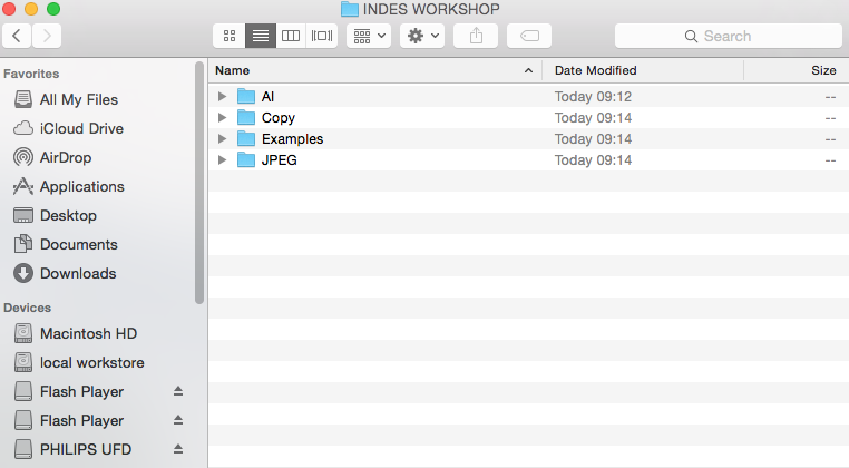
I took part in an In Design workshop to develop my skills in making a professional looking zine. I learned the efficient way of organising folders to make life a lot easier when it comes to creating the zine.

Once all of the files where organised I could move on to creating the layout of the document.

I started by importing the photo onto the document, I wanted to make a poster based on the theme of my zine, so I used one of my own photos.


I then added text and changed the font to fit the style of the zine, and the poster. 


I wanted to create a quick logo for the poster to advertise the company of the festival that I created for the poster. This didn't really work as planned as the text wouldn't sit right on the circle. I had to make lots of adjustments to get it right . 

Here is the final finished poster. 

I also designed a college poster 


over all this workshop helped me to learn new skills, develop my magazine as a whole and improve the layout ideas I originally had for my magazine. By making this poster I was able to learn the basics of In Design, such as spacing, type, and text alignment. 


Sunday, 22 May 2016

Sea Recipes Typography


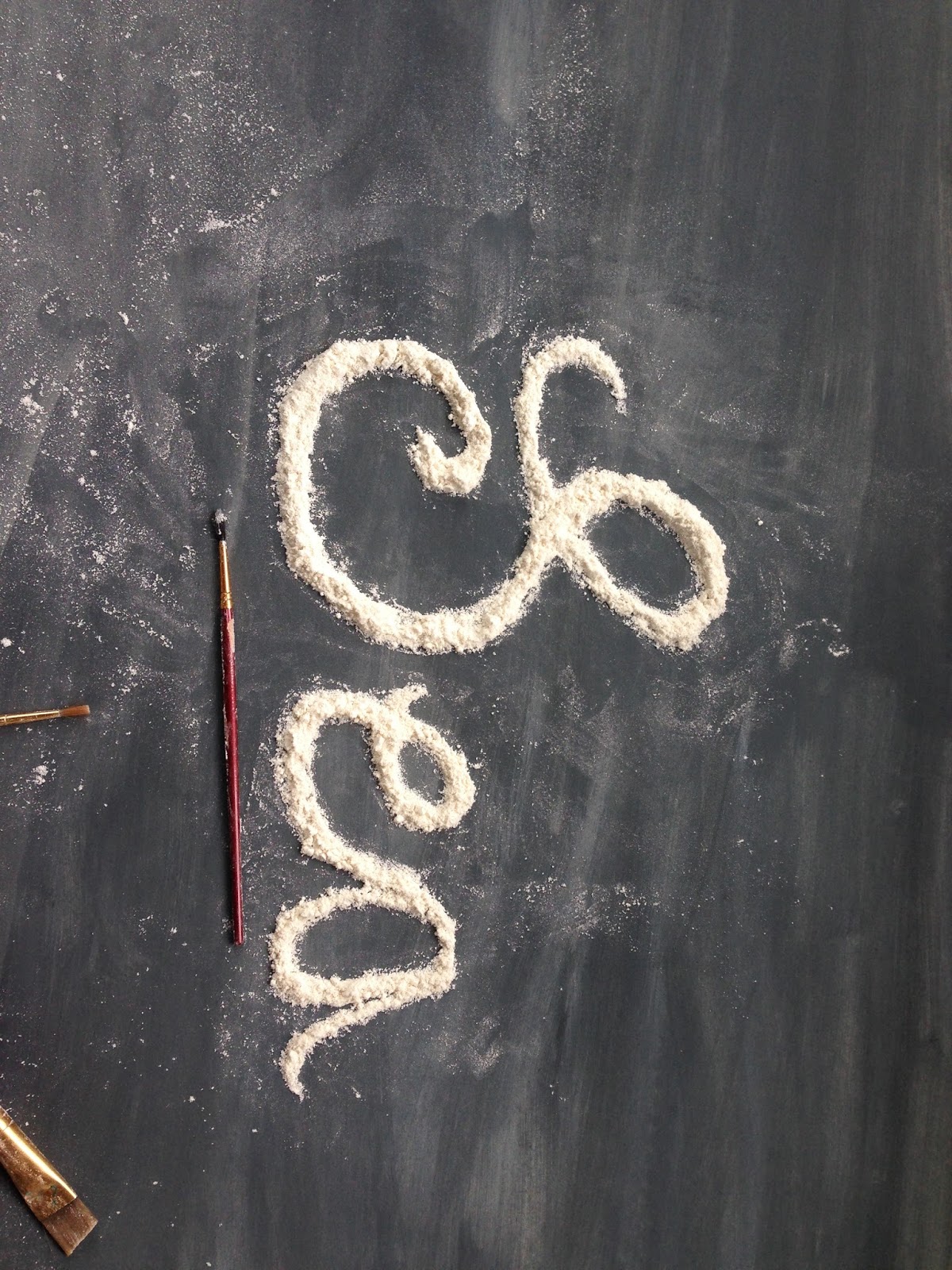
I started to create my design using flour and a paint brush to sculpt the letter to get fine detail. The first letter took me at least 15-20 mins, then the process started to get a lot faster once I got used to using the brush in the right way to delicately form the words. After I had finished the words, I used fruit and vegetables for more decoration to make it look more attractive. The whole process took me 1 hour, not including the photography which took me half an hour or so to set up the layout for the photo.


Tuesday, 17 May 2016

Food typography

based on my research into food typography, I have drawn out some designs of my own which I plan to try out using flour and other ingredients to make.
here are photos of the process in which i went through to get to the point of my final designs.


Food typography

I have recently been researching different ways of displaying the chapters of my zine, such as title pages. I have included a recipe section in my zine and I think that this would be an effective, eyecatching way of introducing the recipes.Here is a moodboard of all the examples of food typography I found.


Interviews with people/public

I explored the streets of Looe and the beach and asked various people different questions about the style of living, and life by the sea and what effect it has on them. I plan to use their responses to write an article for my zine.


Interview with people in Looe

Questions

1) Are you visiting, or do you live locally?

2) If you could describe your surroundings in one sentence what would it be?

3) Describe how life by the sea makes you feel.


Answers

1)   Visiting age 40-49
Visiting age 20-29
Visiting age 50 and above
Local age 40-49
Local age 40-49


2) Peaceful
    Don’t know how I would describe my surroundings to be honest.
My surrounding are beautiful.
The community has such a wonderful bond.
Friendly.


     3) It makes you feel like you don’t want to go home.
It makes me feel Invigorated.
It makes me feel relaxed.
It makes me feel good.
It makes me feel relaxed, wonderful and well.

Interview with fish monger

I interviewed a fish monger about their business, it was very interesting to talk to a local business and find out about the history of the business. Pengelly's has a very friendly atmosphere, and where more welcoming to their customers, and regulars. They where more than happy to help me with my project by allowing me to be apart of the atmosphere and take in what the business is really about.


Interview with Pengelly’s Fish Monger


1) Is there anything you would say to people about why they should buy locally rather than go elsewhere, such as large retail Supermarkets?

It is important to support our industry for jobs, not only do we land one of the most good quality fish in the country, it provides people with jobs, it’s about sustainability.
We don’t take all the stocks because we fish daily and locally, we only take what we need plus you are always guaranteed fresh fish. We buy from day boats, and are probably the only ones in Cornwall who specialise from Looe fish.  We are the 5th generation of fish mongers from the family business, and between all of us there is over 100 years of experience.

2) Is anything else you would like to add about your business that is significant to you?

We are responsible buyers who buy from responsible fishermen, who fish sustainably.
The business is also unique because it is run by all women.


3) Are there any fish recipes you would suggest ?

Because the fish is so fresh you don’t need to over complicate it because the taste will be fresh, you can season the fish with a coat of flour and sprinkle a bit of black pepper on the fish, then fry it piping hot with oil and the juice of a lemon.


Thursday, 12 May 2016

Jewellery Design

Here is a first draft sketch of the jewellery I plan to make. For other designs I plan to add beads onto the rope.

Purse Design

Here is a rough first draft sketch of my design, for the small purse I plan to make from my prints.

Tuesday, 3 May 2016

Collage


Here is my final collage work I made, in the workshop today, I have evaluated my experience and what I learned from the workshop below. I tried to make it in the style of clover robin.