
Showing posts with label Unit 9. Show all posts
Showing posts with label Unit 9. Show all posts
Wednesday, 22 June 2016

Tuesday, 21 June 2016
In Design workshop pt 2


I took part in another In Design workshop, I learned how I can showcase my work using the social networking sit called Instagram. I learned how to create a promotional poster to put on Instagram and different ways you can promote you as a designer and how businesses use social media to reach out to more people.
CV unit 9
I am a student currently studying Graphic Design
at Plymouth College of Art, I have a passion for creating and discovering new
things. The main areas I specialize in are graphic design and illustration, I
love designing and coming up with new ideas and hope to go into magazine design
and branding.
Achievements
I’ve been involved with the
college since I was 12 years of age, attending Saturday Arts Club for 4 years,
throughout this I was able to go to achieve a Bronze Arts Award. This then lead
me to do my further education at the college. In my first year of college I’ve
been awarded first prize for best poster design for a company called Regen
Southwest, to promote renewable energy.
Qualifications
English language B
English Literature B
Child development B
Maths C
Writing a CV
From creating a profile on Linked in and Behance I was able to use this as a foundation to start create a CV.
 Before doing this I researched some examples of different ways people have discribed themselves and their achievements, this gave me an idea on how to write my introduction.
http://www.linkedinsights.com/3-stunningly-good-linkedin-profile-summaries/

http://www.linkedinsights.com/3-stunningly-good-linkedin-profile-summaries/
Unit 9 Linked in Profile


This was the task we where given, to create a linked in profile and connect with people.


I have sent following requests to people and potential employers, this will allow me to connect with my peers at college and find potential work opportunities in the future, or part time as a student. It will also help me gain experience from professionals and potentially find work experience.


By creating a linked in account and profile, it has allowed me to connect with professionals on one of the largest professional social networking sites in the world. I can showcase my achievements/success and business on this site.
Unit 9 universities
As part of the unit 9 criteria we had to show how we have researched into further education or/and potential job vacancies we would like to have in the future. I have recently been looking at universities and the different courses on offer.
The first university that I researched was Plymouth university.


 https://www.plymouth.ac.uk/
My first impressions of the course was quite positive, and seemed inviting. What I have learned from researching going to uni, is the prices! It is so expensive to go on a course at uni, and if you are thinking of studying away you have to think about student flats available which is even more money.
I have also learned that the courses can be lengthly which means another three to four years in education. Although Plymouth university does offer part time courses which gives you the option to work in your free time. which made me consider whether I wanted to go on to do an apprenticeship.
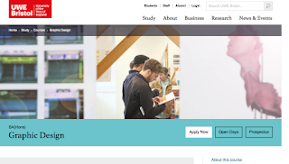


http://courses.uwe.ac.uk/W211/ LINK to Bristol university
London University of Arts
http://www.arts.ac.uk/lcc/courses/undergraduate/ba-hons-graphic-and-media-design/#

Birmingham school of visual communication
http://www.bcu.ac.uk/visual-communication/courses/vis-com-illustration-ba-hons


The first university that I researched was Plymouth university.


My first impressions of the course was quite positive, and seemed inviting. What I have learned from researching going to uni, is the prices! It is so expensive to go on a course at uni, and if you are thinking of studying away you have to think about student flats available which is even more money.
I have also learned that the courses can be lengthly which means another three to four years in education. Although Plymouth university does offer part time courses which gives you the option to work in your free time. which made me consider whether I wanted to go on to do an apprenticeship.


http://courses.uwe.ac.uk/W211/ LINK to Bristol university
London University of Arts
http://www.arts.ac.uk/lcc/courses/undergraduate/ba-hons-graphic-and-media-design/#

Birmingham school of visual communication
http://www.bcu.ac.uk/visual-communication/courses/vis-com-illustration-ba-hons


Monday, 20 June 2016
Unit 9 Creating a behance account


I have recently uploaded one of my final pieces onto my Behance account, I have also followed 10 professional creatives in the graphic design and Illustration industry. This has allowed me to view other peoples work, and jobs that are available in the industry this in turn could help me to develop a more solid idea of what job I am looking for when I finish my education.
Monday, 16 May 2016

Tuesday, 26 April 2016
Contextual Studies

Here is one of the images I took whilst experimenting with photography, I thought it was significant for my contextual studies as it is an example of history, and once everyone was using one of these, now hardly anyone uses a phonebox and you hardly see them around.
The First ever magazine that was published was the German Erbauliche Months Unterredungen released in 1663. Unlike todays magazines the first magazines where written mainly by only one author, the target audience for magazines where the Intellectual type and didn't appeal to a wide variety of audiences like todays magazines. The subjects included court events, theatre and literature, mainly aimed towards the men rather than women. The first women's magazine was Ladies Mercury launched in London in the year 1693.

Website: http://www.magazinedesigning.com/history-of-the-magazines/
Author: Nikola


Unit 9
Recently I took part in a group critique task. We each had to present our work to the group of students from other courses as well as our own, then we would take it in turns to critique each others work and say some positives and negatives and what to improve.
I evaluated my experience:
I thought that I explained what I needed in the time given, however I felt that I could of condensed my presentation more so I could show only key things that where important in the time given.
Others said that I came across as confident and spoke loud enough for everyone to hear. The presentation went well, better than I expected as I was feeling a bit nervous leading up to it. I felt it helped that I was talking about something that I enjoy and am passionate about, and this meant that I didn't have to think too much about what to say. This also meant that what I was saying came across as more natural when I was talking and I felt more relaxed.
This experience gave me inspiration for my work from seeing others, I also gained some useful advice and suggestions on how to improve my work, overall it was very beneficial.
This is what others said and there feedback to me.

I evaluated my experience:
I thought that I explained what I needed in the time given, however I felt that I could of condensed my presentation more so I could show only key things that where important in the time given.
Others said that I came across as confident and spoke loud enough for everyone to hear. The presentation went well, better than I expected as I was feeling a bit nervous leading up to it. I felt it helped that I was talking about something that I enjoy and am passionate about, and this meant that I didn't have to think too much about what to say. This also meant that what I was saying came across as more natural when I was talking and I felt more relaxed.
This experience gave me inspiration for my work from seeing others, I also gained some useful advice and suggestions on how to improve my work, overall it was very beneficial.
This is what others said and there feedback to me.

Sunday, 24 April 2016
Logo Design Unit 9

 |

My logo design process Unit 9


This is one of the first designs that I made, I thought that It was ok but the leaves where a bit too distracting, and it was too detailed.

I tried to reduce the amount of space and condense the leaves, I also changed the colour of the text to black and widened the green strip behind.
I decided to work with shapes from researching a few artists on pinterest, here is a rough copy of what I came up with.

This was an unknown artist that I came across on Pinterest, I liked
there use of line and shape, also the use of natural leaves in the logo.

Herb Lubalin
Herb Lubalin
Herb Lubalin was an American graphic designer, he worked with Ralph Ginzburg for a magazine company, he created and designed the typeface ITC Avant Garde.
Lubalin's work is creative and elegant. I love the use of typography in his logo's, for each company you can see that he has clearly adapted the style of typography to fit the theme and character of the business. Unlike Paul Rand's work Herb Lubalin creates a 3-D effect in some of his logos, however both artists stick to minimal colours in their work. I like how Herb Lubalin's logo's are almost an artwork in itself and not just a logo, for instance the mother and child logo, you can see that he has beautifully created the image of a mother carrying her child within the o of the word mother.
To conclude I think that both artists are unique, and each have different qualities to their work, although i think that I prefer Herb Lubalin's work because of it's individuality of each of his logos.

Herb Lubalin was an American graphic designer, he worked with Ralph Ginzburg for a magazine company, he created and designed the typeface ITC Avant Garde.
Lubalin's work is creative and elegant. I love the use of typography in his logo's, for each company you can see that he has clearly adapted the style of typography to fit the theme and character of the business. Unlike Paul Rand's work Herb Lubalin creates a 3-D effect in some of his logos, however both artists stick to minimal colours in their work. I like how Herb Lubalin's logo's are almost an artwork in itself and not just a logo, for instance the mother and child logo, you can see that he has beautifully created the image of a mother carrying her child within the o of the word mother.
To conclude I think that both artists are unique, and each have different qualities to their work, although i think that I prefer Herb Lubalin's work because of it's individuality of each of his logos.

Logo Designers
Paul Rand
A logo doesn’t sell (directly), it identifies.
A logo is rarely a description of a business.
A logo derives its meaning from the quality of the thing it symbolizes, not the other way around.
A logo is less important than the product it signifies; what it means is more important than what it looks like.
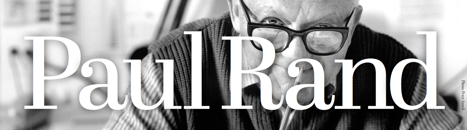
Paul Rand was one of America's leading modern graphic designers, his work included advertising, book and corporate design. He studied at Parsons School of design in New York City, although the majority of his work was self taught.
His Logo designs have a fresh and clean look, I have noticed from studying his work he uses a lot of negative space in his work, this makes the eyes focus on specific parts of the logo such as the text. Paul Rand also sticks to a minimal amount of colour, this way it is still bold but isn't distracting and overpowering.


Here’s what a logo is and does: Written by Paul Rand himself.
A logo is a flag, a signature, an escutcheon.A logo doesn’t sell (directly), it identifies.
A logo is rarely a description of a business.
A logo derives its meaning from the quality of the thing it symbolizes, not the other way around.
A logo is less important than the product it signifies; what it means is more important than what it looks like.
Paul Rand was one of America's leading modern graphic designers, his work included advertising, book and corporate design. He studied at Parsons School of design in New York City, although the majority of his work was self taught.
His Logo designs have a fresh and clean look, I have noticed from studying his work he uses a lot of negative space in his work, this makes the eyes focus on specific parts of the logo such as the text. Paul Rand also sticks to a minimal amount of colour, this way it is still bold but isn't distracting and overpowering.

Subscribe to:
Posts (Atom)